Redesigning Valorant’s In-game Shop
I’ll be honest; I’m a big fan of Riot Game’s Valorant. It’s a 5v5 tactical shooter where two teams compete to either plant or defuse a ‘spike’ (or bomb). Admittedly, I’m not the best at the game, but its social aspect, especially playing with friends, makes it hard to turn down.
I’ve been playing this game for about a year now and have joined the Sub-reddit as well. I agree the game isn’t perfect, but Riot has had some excellent updates and some not so good updates.
One of the most popular aspects of the game is its gun skins. Cosmetic items give guns a fresh coat of paint with stylish animations and sounds. Unfortunately, these skins cost real money and are highly sought after. I haven’t delved into the world of skins (until recently oops), considering the fancier the skin, the higher the price. Nevertheless, a dedicated group of users collect every skin that comes their way, and users patiently wait for their favourite skin to show up in the store again.
As a result, the most common complaint is the Valorant in-game store. With only four random skins being offered at a time, players get easily frustrated when the skin they want doesn’t show up for weeks together. Seeing this issue arise on Reddit repeatedly made me think, is there a solution to this?
The Problem:
- Players are annoyed their skin doesn’t show up in the little daily in-game shop.
- Logistically, giving players complete freedom to buy any skin could be counter-productive. However, finding a middle ground between providing more options with a sense of randomness would help.
- There is no way to buy previous Gun-Buddies or Player Cards. However, these tend to be relatively inexpensive compared to gun skins.
Here is what the current store looks like:

There are only two distinct offerings:
- The featured collection. These tend to be in the shop for around two weeks.
- The offers section comprises four random melee or gun skins. This is refreshed every day/ every two days.
There is a lack of opportunities to buy new skins.
Creating a Solution:
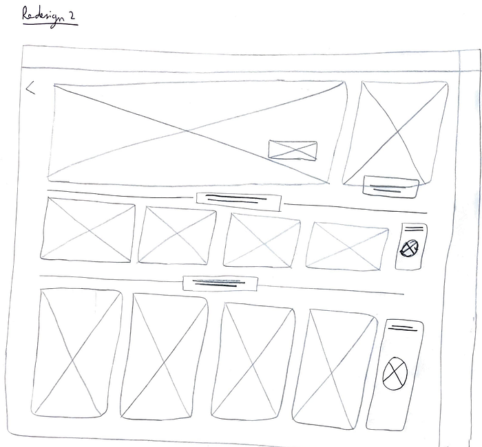
Creating rough sketches.
Redesigning an interface for one of the most popular games was no easy feat. Adding distinctly new features while keeping the interface familiar was quite a task.

The idea is to add:
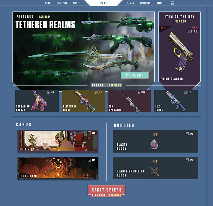
- An “Item of the Day” section is a random item on discount for 24 hours.
- “Offered Items” Comprises four gun skins, along with Player Cards and Gun Buddies. These items retail at their standard price.
- A “Refresh Offers” button. This button refreshes all “Offered Items”, including gun skins, player cards and gun buddies. This idea provides players with another opportunity to get the skin they want while still only showing random skins.
- Players can activate the “Refresh Offers” button for a small fee using “Radiant Points”, an in-game currency. I’ve chosen “Radiant Points” over “Valorant Points” (another in-game currency) since players can obtain them for free by playing the game. “Valorant Points” can only be bought by spending real money.
Mockup User-Interface
After an afternoon of designing and redesigning, I finalised the layout.

Features:
- I have retained “Featured Items” as the most prominent store section.
- By positioning “Item of the Day” next to “Featured Items”, I allowed it to have a similar amount of importance as “Featured Items” since this is a discounted item.
- The “Offers” area remains the same, with four gun skins. Alongside them, two Player Cards and two Gun Buddies are offered. I kept only 2 of them since I assume players would not be as interested in buying cards or buddies.
- Reset Offers is at the bottom once the player has seen all their options. This is coupled with a timer, denoting when it will be available next.

Note: The daily timer for “Offers” does NOT reset when a player clicks on Reset Offers. Only the items change.
That’s it! This was my journey of redesigning an interface based on some user problems. It’s my first time doing something like this, so any feedback is welcome. Thanks for reading!